Throughout my teaser trailer there are various parts that I’ve created to either use, develop or challenge forms and conventions of real media products. I had to focus on areas such as:
* The font (style and colour).
* The location(s) that I would use for filming.
* The costumes and props that I used in my trailer.
* Which transitions I used to connect the sections of my teaser trailer together and what camerawork angles I used.
* How the above sections mentioned were used to ‘tease’ my target audience.
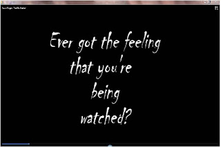 I decided to use ‘Chiller’ font for the writing that appeared in my teaser trailer because it links in with the genre that I chose for the film. I also chose the colours black and white because not only do they go well together but the white stands out and it helps create that horror look. This is a convention that I have used because in other
 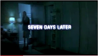 horror teaser trailers that I watched and analysed when doing research, the majority used colours like red and white for the writing when it was against a black background. An example for this would be the font in the teaser trailer for ‘The Ring’. Although the background in this teaser trailer is a scene from the film, It was still able to give me a rough idea of the way that it would look for my trailer. I could have done this with my teaser trailer but I thought that a black screen would look a lot better. I think that the background works well in 'The Ring' teaser trailer but I think it takes the writing takes the attention away from the footage in the background. This is why I didn't use some of my own footage for the background because I thought that it would have been too much for the audience to focus on at one point.
 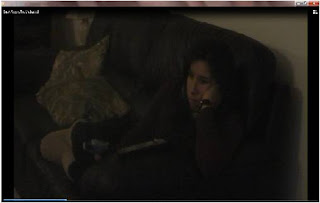 The costume that I got my character to wear was an outfit that would be worn when lazing around the house, so it was plain dull colours that wouldn’t take the attention away from the feeling that I was trying to create with the trailer, this simple looking outfit makes my character look comfortable but vulnerable at the same time. This is a convention that I think I have challenged because main female role characters in a horror film are dressed in a vulnerable way by wearing clothing like low cut tops, short skirts etc. I think this outfit has worked well for my character but because of the darkness of the footage, it makes it hard to see what she is wearing.
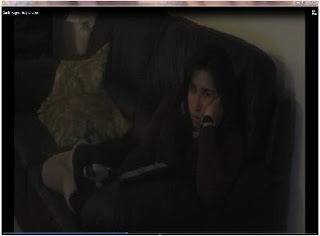 The setting/location which I used was the characters house which was set out to be like any other home environment. This would then create a normal feel for the opening of the film. Having the house as the location creates a home feel where everyone can feel safe in and that’s why I made the house the main setting for my trailer. It’s making the character feel the opposite of how she is meant to feel in her own home. I feel that I have challenged this as a convention as I've created the home as the location but have kept the amount of house shown to a minimum. I don't think this works as well as I had imagined it to have when I was planning it, so if I was to film this again, I would film footage from various areas of the room so that I had a wider variety of shots to choose from.
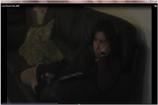 The angles I used in my teaser trailer are very similar to each other and are all overhead shots of my character. This is to show her vulnerability which is to be shown later on in the film. I positioned the camera in the area of the room that was nearest the front window. This was meant to create the feeling that her every move is being watched by someone/something through her front window. Although when filming these scenes, I wasn't able to see that the lighting was a little too dark and only found this out when looking over the footage when putting together my teaser trailer. If I was to redo the filming, I would change this and make sure that the lighting of scenes were decent enough to see what is going on.
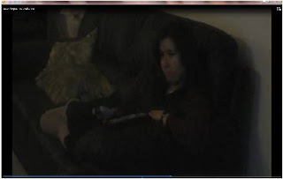 The editing transitions which I used in my teaser trailer was mainly fade (in an out). I used this transition so that it would show a 5 second clip and then move onto the next one, it would then get the audience thinking about the clip that they have just seen. I feel that these transitions work well on these scenes because it makes them flow smoothly. The angles I have used is challenging the forms and conventions of real media products because proper teaser trailers would use a lot of various angles and shots which they film. I thought that this would be a good convention to challenge so I kept the angles to one corner of the room but when I had put my teaser trailer together and watched it back, It didn't create the right look that I was hoping for. So therefore this would also be another thing to change if I was to re-make my teaser trailer.
 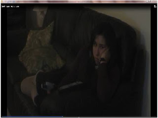 I’ve chosen these three frames as my elements that I think ‘tease’ and intrigue my target audience. The reason that I’ve chosen the first frame is because I feel the way her eyes move side to side show the audience that she is already sensing some strange things happening and the way that she sits still and just uses her eyes to scan the room indicate that she is a little freaked out about these things.
 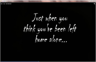 I chose the second frame because I think the writing helps create a mysterious horror opening to the trailer and the question that it asks makes the audience think about why they are being asked this question. I used this because of my original idea of using a similar writing to the style that was shown in 'The Ring' teaser trailer.
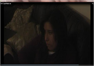 Finally I chose the final frame because of the change of lighting that occurs in the clip, this then begins to question what other strange things are happening or will happen to her further in the film. When filming this scene, the lighting changes created a good effect and it wasn't until I watched it on Pinnacle that it I noticed it was difficult to see the lighting change. Because of the darkness of the lighting, I feel that this ruins the scenes a bit and would it would be the main thing that I would change.
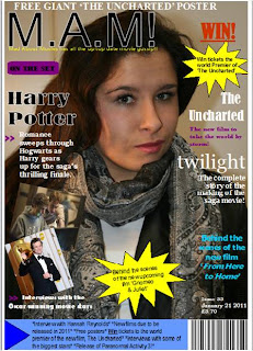
Magazine Font – Big, bold and stands out against the main picture – This is common in a lot of film magazines that I found when doing research.
Magazine Title – Mad.About.Movies! Which is shortened down to M.A.M! I challenged this convention as I thought that having a one word title was too original and I wanted a title that could be shortened down to it’s initials. Images – For the main image I used a picture of my actress in character. I used this convention as it was used on a lot of film magazines which I researched. Magazines such as Empires August 2006 edition which has Harry Potter as its main image.
Cover lines – I found that a few magazines I looked at had various different cover lines which grabbed my attention and also a few that I had one simple cover line that advertised one film. I found the simple 1 cover line was a little boring and plain which is why I went for various cover lines on my magazine cover. For some of them I used big bright shapes would help attract the audience to that one first.
Colour – I used various colours on my magazine cover so that I had a variety and I wasn’t just sticking to one colour like a few magazines that I researched did. I found that the magazines which used one colour didn’t grab my attention as much as the magazines that used various colours. If this appealed to me then I thought it would also appeal to my target audience.
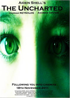
Title – ‘The Uncharted’- Unknown: ‘The nation’s geographical strategy is yet uncharted’.
Image – I used a close up image of the face which focused on the eyes so that it gives the feeling of being watched. The research which I did showed the main image to be shadowed or at least part of the image in shadow. I used this convention as I thought it would leave the identity hidden.
Colour – I used the colour black for the title so that It stood out against the main image and the block capital letters made it clear and easy to read which I thought was a convention that I challenged. The main image is tinted green so that it represents envy/jealousy.
Tag Line – I thought that ‘Following you into cinemas’ would be a great tag line for a film poster as it links in with the storyline about the character having her every move followed. I didn’t find any tag lines of this sort on posters which I research so I think it’s also another convention which I have challenged.
Billing block – The billing block at the bottom of the poster is a convention which I have used as this shows up on most film posters. From asking my target audience, I found that having it placed at the bottom looked better than it being placed at the top.
How effective is the combination of your main product and ancillary texts?
I aimed my teaser trailer at a target audience of people aged between 16 – 25 as I knew that part of my research that I carried out showed that people of this age range liked to watch horror movies such as ‘The Ring’, ‘Friday 13th’ and ‘The Grudge’. I tried to create my media products for a niche audience.
How do the three elements work together?
I think the three elements of my media work well together because I think that the poster really helps to advertise the trailer as a horror, whereas I think that the teaser trailer itself could have a bit to it to make it suit the genre that I was going for. I linked the poster and teaser trailer together by making them both dark in colour. I made the font for the poster and the teaser trailer different because I felt that the black background in the TT worked well and the only colour that worked well with that was white.
What elements do you think are successful in each product? Poster
Good
* The main image and how that the close up on the eyes makes you feel like you’re being watched.
* Clear font which stands out and makes it easy to read
* The billing block, date, names and title are placed in conventional places.
* The colour green makes the image look creepy and I think helps the audience to link it with the genre that I was trying to create.
Bad
* The name on the right hand side of the poster can either be made to a different colour or it needs to be moved slightly to the left because the end of it is a little harder to read than the rest.
* The name above the film title is a little to the left so it needs moving to the right slightly.
Teaser Trailer
Good
* I think the colour writing against the black background is easy to read.
* The darkness of the clips sets the scene of it being a horror.
Bad
* It needs more of a variety of camera angles.
* Perhaps a little more action than her sitting on the sofa, maybe a clip of her getting up and going to investigate what the noises could be.
* Maybe another production company at the beginning.
Magazine
Good
* A wide variety of colours used on the front cover.
* Bright colours to bring the attention to cover lines like competitions, behind the scenes, upcoming new films etc.
* Barcode, issue date and price are in conventional places.
* Easy block capital title – Makes it easy to read.
* The M.A.M! has been explain in a short tag line underneath the title.
Bad
* A clearer image or an image of the character in a different scenery.
* Could be a little crowded or things could be harder to read.
What difficulties have you overcome?
This year I feel that I have overcome a list of difficulties since I have worked on my own and last year I was part of a group. The list of difficulties which I have overcome are things like:
* Learning how to add/remove transitions and upload filming into pinnacle.
* Learning how to make my teaser trailer into a movie so that I was able to upload it onto the social network, Facebook.
* Knowing how to cut a clip so that it’s only the footage that I needed for my teaser trailer.
What have you learnt from your audience feedback?
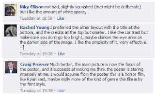
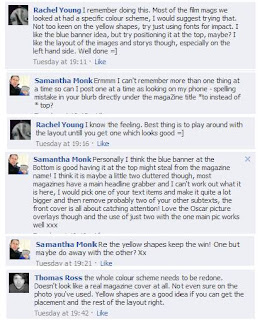
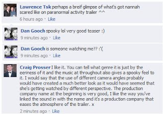
I used the social networking site facebook to get comments on all three parts of my coursework. Some comments were really helpful and I used these comments to make changes to my teaser trailer, magazine and poster. Facebook links in with my target audience as the majority of the people on Facebook are people aged the same as my target audience. Audience feedback which I received from facebook for my Poster, Magazine cover and Teaser trailer.
